Collapsing multidimensional wellbeing into equivalent income
Published: 3 March 2022
We want public policies to improve people’s wellbeing and reduce inequalities in wellbeing. But how do we measure 'wellbeing'?
Public health professionals might say ultimately, it’s about health, whereas economists might say it’s about income. But increasingly, policy-makers and academics are interested in multi-dimensional wellbeing, where we accept that wellbeing involves different things such as health, income, housing quality and neighbourhood safety.
One major advantage of multi-dimensional wellbeing is that we get a much richer description of somebody’s situation. But interpreting the overall situation becomes more difficult. If somebody gets a better paid but stressful new job, and their income goes up but mental health suffers, are they overall better off, worse off, or about the same? For that, we would need to consider how the different dimensions are valued, relative to each other.
One of the aims of SIPHER workstream 6 is to find out how members of the general public value the different dimensions of wellbeing.
There are three challenges here:
- which indicators of wellbeing to consider;
- how to elicit the relative value of each indicator; and
- how to summarise multi-dimensional wellbeing in one index number.
The seven indicators of wellbeing
To address the first challenge, in early 2020 the SIPHER team agreed to use a suite of seven wellbeing indicators, which we refer to as the “SIPHER-7” (Tsuchiya and Wu, 2021). It covers:
- physical health affecting daily activities;
- mental health affecting daily activities;
- feeling lonely and left out from others;
- household disposable income after housing costs;
- employment situation (or main daily activity);
- housing quality; and
- perceived safety of the neighbourhood.
Of these, income is measured on a continuous scale, while the non-income indicators have three, five or six categories. The combinations of answers to each of these indicators capture different wellbeing states, or SIPHER-7 'profiles'. There are more than 7,000 combinations of the non-income indicators.
Eliciting the relative value of each indicator
To address the second challenge, workstream 6 conducted a large-scale online survey to find out how the UK general public values the different SIPHER-7 profiles. We used a method called “discrete choice experiment” (DCE), where survey respondents are shown two SIPHER-7 profiles at a time and asked to indicate which one they prefer.
Figure1: This box reproduces one of the practice questions given to the survey respondents:
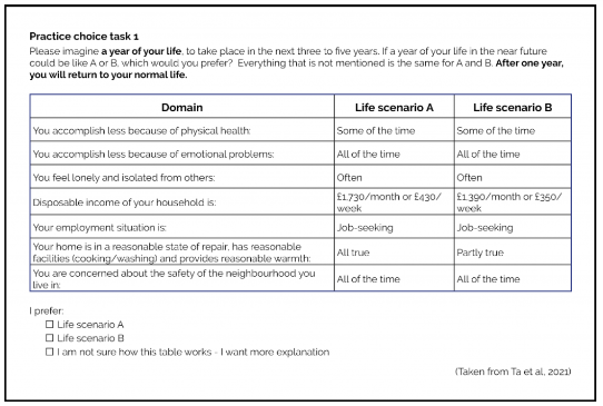
This is the first of three practice tasks. With five of the seven domains tied across life scenarios A and B, and the two non-tied domains both better in life scenario A than in B, it is straightforward to choose A over B. In the actual choice tasks, two out of seven domains were tied, and of the remaining five dimensions, some were better in A, others in B. So the actual questions were more difficult than the practice questions.
Overall, there were 120 choice tasks, selected following principles of choice design. These were split into 12 sets of ten choice tasks, and survey respondents were allocated one set, answering ten choice tasks each.
How do we get from ordinal data (prefer A or prefer B) to quantitative results? Imagine three possibilities:
- Survey respondents all think that life scenario A is clearly better than scenario B. If so, the great majority would choose A but a small proportion might still choose B in error.
- Respondents think that scenario A is somewhat better than B. Because the difference is now less stark, the proportion choosing B in error would increase accordingly.
- Respondents think that A and B are roughly equally good, but the survey does not allow ties. So they would be split roughly 50-50 between A and B.
The analysis of DCE data assumes a relationship between the degree by which one scenario is better than the alternative and the proportion of respondents who choose this scenario over the alternative. By fitting the distribution of respondents’ ordinal responses to this assumed relationship, the analysis converts the proportion of respondents choosing one option over the other into a quantitative scale of relative value. This is then modelled in terms of the indicators in the relevant life scenarios, using regression analysis.
Summarising multi-dimensional wellbeing in one index number
To address the third challenge, we used a measure of wellbeing called “equivalent income” (Fleurbaey, 2005; Fleurbaey and Schokkaert, 2012) to collapse multi-dimensional SIPHER-7 into a single number. Equivalent income takes actual disposable income as the baseline and then, to represent a person’s wellbeing, adjusts it downwards for any non-income aspects of life that are not at the best level.
- If somebody lives alone with an annual disposable income of £30K, and she has no problems across the remaining six SIPHER-7 dimensions, her equivalent income remains £30K.
- But if she feels lonely often, then her wellbeing is lower, so her equivalent income is adjusted to reflect this deficit.
- Alternatively, if she lives in a poor-quality home in a disadvantaged neighbourhood, then her income is downward adjusted to reflect the value of good quality housing and neighbourhood safety that she lacks.
The DCE results provide us with the necessary information on the relative value of the different wellbeing indicators. It gives us an algorithm to calculate equivalent income for any SIPHER-7 profile.
The results of our online surveys indicate that, for example, feeling lonely often is worse than physical health affecting daily activities most of the time, but better than mental health affecting daily activities most of the time. Job-seeking is similar to being concerned about the safety of the neighbourhood some of the time.
In terms of equivalent income, in the example above, if somebody lived alone with an annual disposable income of £30K and often felt lonely, the level of equivalent income is very similar to the case where instead she lived in a poor-quality home and was concerned about the safety of her neighbourhood all of the time: both are approximately £18K.
We now have an answer to the very first example. Imagine somebody living alone with an annual disposable income of £30K, with no problems across any of the SIPHER-7 non-income dimensions (and therefore a baseline equivalent income of £30K). If he gets a new, better paying but stressful job, so that his disposable income increased to £40K but his mental health came to affect his daily activities all of the time, this has an equivalent income of approximately £20K. Our survey results suggest that overall, he was better off before.
The views and opinions expressed in this blog are those of the author/authors.
References
- SIPHER-7 [PDF] A seven -indicator outcome measure to capture wellbeing for economic evaluational. Tsuchiya, A. and Wu, G. (C.) (2021) (doi: 10.36399/gla.pubs.310977). (Enlighten ID 310977)
- Fleurbaey, M. (2005). Health, Wealth, and Fairness. Journal of Public Economic Theory, 7(2):253-284.
- Fleurbaey, M., Luchini, S., Muller, C., & Schokkaert, E. (2013). Equivalent income and fair evaluation of health care. Health Economics, 22(6):711-729.
- Ta, A.T., Van Landeghem, B., & Tsuchiya, A. (2021), Eliciting public preferences across health and wellbeing domains to calculated equivalent income, paper presented at the Health Economists’ Study Group conference July 2021, Cambridge Ref HESG ID# 2043
First published: 3 March 2022
<< Blog