

The link between population health and health inequality
Published: 16 June 2017
Is life expectancy increasing? Is health inequality decreasing? These are fundamental questions for population health. It is thus natural to ask if life expectancy and inequality are related.
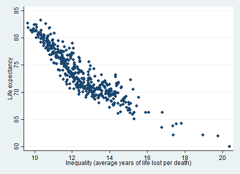
Is life expectancy increasing? Is health inequality decreasing? These are fundamental questions for population health. It is thus natural to ask if life expectancy and inequality are related. The figure below shows they are. It compares life expectancy – average age at death – to the distribution of the age at death around this average (inequality). If everyone died at the same age there would be no inequality. So average years of life lost per death measures inequality. Higher life expectancy is associated with lower inequality. Each dot is calculated from 5 years worth of data for a country, with 41 countries observed since 1950 (i.e. one dot is for Scotland in 1950-54).
What about change?
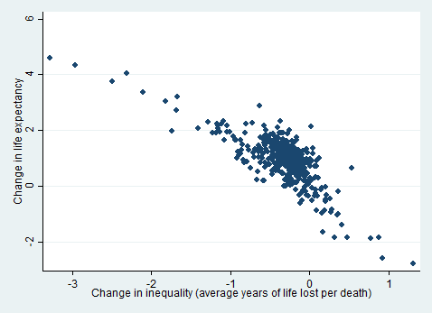
But what if inequality decreases, does life expectancy increase (and vice versa)? The next graph compares change in life expectancy to change in inequality from one five year period to the next within countries. For example, one of the dots represents Scotland 1955-59 compared to 1950-54. Improvements in life expectancy are associated with decreasing inequality.
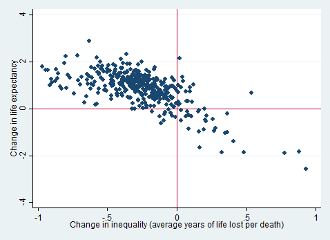
The eye is rather drawn to the extremes in the graph above. Below I focus on changes in inequality between -1 and +1 years where the bulk of the dots reside. I add red lines for no change in life expectancy and no change in inequality. This divides the graph in four. Most dots reside in the top left quadrant, decreasing inequality with increasing life expectancy. There are only a few instances of increasing inequality and increasing life expectancy (top right). There are also not many examples of decreasing inequality and decreasing life expectancy (bottom left). More dots are in the bottom right, representing increasing inequality and decreasing life expectancy. Most of these are changes within countries of the former USSR / Soviet bloc around the time of its collapse.
But…
Yes, I know. This isn’t the normal way to measure health inequalities. Where’s the measure of socioeconomic position? Researchers usually measure inequality by comparing life expectancy between socioeconomic groups. However, if you believe that differences in life expectancy are socially determined then why not differences in variance in life expectancy? This is not to suggest one approach is better than the other. In my view they are complementary. Indeed the approaches have been combined.
So what?
Demographers have shown the connection between life expectancy and its variance a number of times before, see here for an example. There has been less focus on how change in one is associated with change in the other. But the point of this post is not to present new results. Rather, that there is a possible connection is important to highlight. It means that reducing inequality may be a good way to improve life expectancy and vice versa.
Data and code
My data source is the Human Mortality Database. It covers higher income countries. You have to register but the data is free.
Disclaimer: The views expressed in this blog are those of the author.
The MRC/CSO Social and Public Health Sciences Unit is funded by the Medical Research Council and the Scottish Government Chief Scientist Office. The views expressed are not necessarily those of the Medical Research Council or the Scottish Government.
First published: 16 June 2017
-