

Use of colours
Use only one colour in any screenful of content. This is in addition to the 'University blue' of the banner.
Connect: busy & more difficult to read version
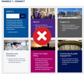
Imagery, black and off-white (such as light grey) do not count towards your one colour.
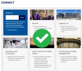
Connect: clean preferred version
Secondary colours
Tiles
Whenever you can, use use light grey or transparent tile backgrounds from the primary colour palete. This will maximise the readability of text. On occasion, you may use a secondary colour (or 'University blue') or a tile background, but never use two secondary colours on the same row or screenful of content.
Call-to-action buttons
Use University blue.
Accordions
Use University blue or light grey.
Secondary dark colours
Rationale
Our aim is to help you maximise the usability and readability of your web site.
2 colour rule
Using only two main colors in design:
- creates a clean and direct message
- is focused and easy for the human brain to process
- minimises visual clutter
- makes our brand easier to remember
- guides the viewer's eye to the most important parts of your web page
Too many colors fight for attention and confuse the viewer.