

Design guidelines
All design should follow the brand guidelines. The design principles below explain how the brand guidelines are applied to design.
Logo
Digital and print marketing materials including publications, flyers, brochures, posters, postcards, banners: The logo should be placed on the front cover (usually top left), and should not appear anywhere else in the collateral. Unless no other option, the space to the right of the marque should not contain any text.
If the logo is placed over a photograph, illustration or other artwork, the logo should be boxed. It can be boxed or unboxed over a solid colour.
PowerPoint slides: the logo should appear on every slide. PowerPoint templates have been set up with the branding in place.
Social media: the logo does not need to appear if the profile image already includes the crest.
Video: the coat of arms in a blue box appears top left throughout video. Videos should finish with an animated video logo.
Work with external designers
The University works with a framework of approved design agencies which can support you with all of your design requirements. Here's a helpful guide to steer you through the process of working with our designers.
Brand message
Our University logo and brand message should work together.
The logo always appears at the top (usually top left). Our brand message should appear at the bottom, either lined up with our logo on the left hand side or ranged right.
If our logo is boxed, our brand message should also be boxed.
If our logo is unboxed, our brand message should be unboxed.
If the print or digital shape is portrait or square, then the brand message should be stacked.
If the print or digital shape is landscape, then the brand message should be linear.
The stacked version of the brand message (both boxed and unboxed) should be the same width as the boxed or unboxed logo.
The linear version of the brand message (both boxed and unboxed) should be double the width of the boxed or unboxed logo.
Imagery
Whether a photograph, illustration or icon, a single image should always be used as the front cover of a publication, poster, splash image, tile, banner or PowerPoint slide. The image should fill the entire print or digital space.
Photography
Photography is one of the most effective and memorable ways we can reflect our brand personality and communicate our brand message.
Good photography will showcase the world-class activities of the University and its people. It should communicate our confidence and ambition, and should capture our contemporary and forward-looking approach which is grounded in a solid, substantial history.
We have created specific guidelines based on the subject of the photography.
Icons
Icons should be designed in vector format on an artboard with dimensions of 191.7501 pt by 191.7501 pt. Text should not be used on icons. Icons should be white.
For the web: icons should be in either .PNG and .SVG formats and with transparent background. Icons should be created at aspect ratio 1:1 (square).
Grid template
Icon development should follow the approved grid template, which is available for download. The grid template provides vertical, horizontal, circular and orthogonal guidelines to facilitate the correct alignment of the design of the icon. The grid template contains two main areas, green and red:
- The green areas should contain the icon.
- The red should be empty to serve as a border.
The icon should be white sitting over a coloured background, in an approved colour from our brand colour palette.
Strokes
Strokes should have a weight of 10 pts. Outside corners should be rounded with a circumference of 3pt. Inside corners should be sharp. When icons are finalised all strokes must be expanded and text outlined. For visual consistency, it is recommended that icons be designed with stroke lines as in the examples below.

Illustrations
Illustrations should only be in 2D.
Illustrations should look realistic, but kept simple and minimalist.
When illustrating generic people, these should be lifelike and not ‘cartoonish’ – show skin tones, facial characteristics, limbs etc.
Illustrations of specific people should be realistic line drawings.
The colours used must be from our colour palette (these can be tinted) and should be limited to four colours or less. The background colour should be limited to one main colour.
Shapes and buildings should not have additional textures or be too detailed.

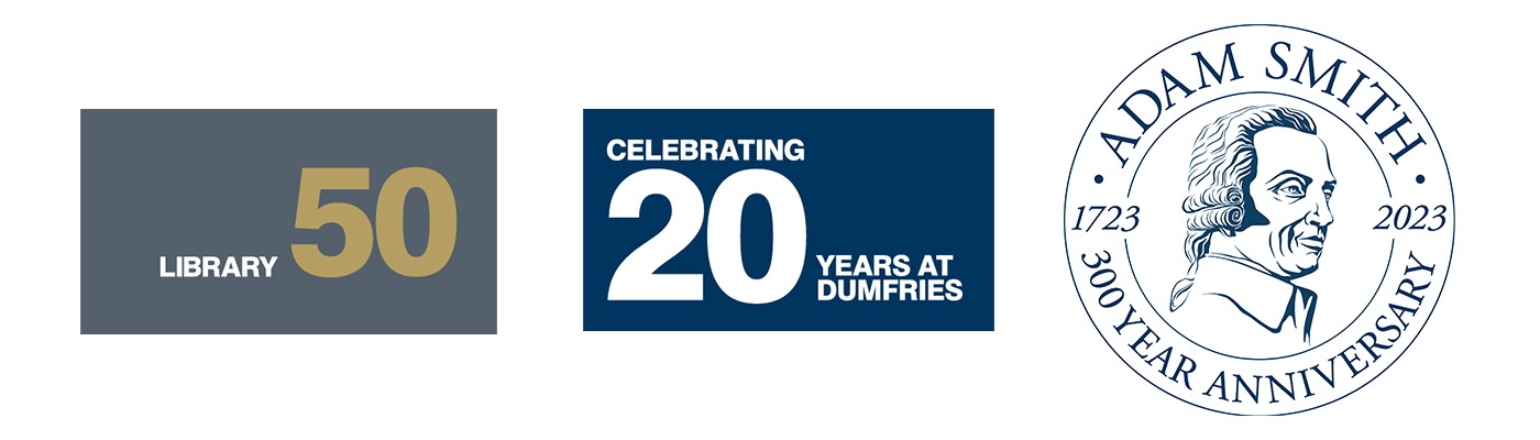
Badges
A badge can be created to recognise and celebrate an important time milestone for a subject area, ie a significant anniversary (50 or 100 years for example). The design of the badge should be simple and uncluttered, following the guidelines outlined below. Please contact: brand@glasgow.ac.uk before you consider the creation of a badge.
- Typefaces: Choose from the two UofG typefaces Noto Sans and Noto Serif.
- Shape: can be either circular or rectangular
- Size: should always appear smaller than the University marque (logo)
- Position: should always appear below the University marque (logo)
- Colour: artwork should be produced in a single colour from our approved palette.
- Illustration: usually a text-based approach is encouraged. However, if an illustration is to be used this should be one simple concept, with very little detail. More than one image as part of the badge is not permitted.
- Usage: usually permitted to run for up to 12 months following the anniversary date to accommodate associated communications and campaigns.
Typography
Titles/headers: use either all caps or sentence case (only capitalise proper nouns).
Do not use full caps for body text, captions, quotes etc as the absence of acenders and descenders makes text that is more than a few words long harder to read.
Colours
We have provided the following values for each of our approved colours in the University's colour palette.
Photography and colour should be complementary where possible.